

Mobilegeddon or Mobiletopia? Your Guide to Responsive Web Design
 As you may or may not know, Google began expanding their use of mobile-friendliness as a ranking signal on April 21st. Although the industry has been dramatically calling this new mobile-friendly update “Mobilegeddon,” referring to the possibility of the end of the world for websites that are not mobile-friendly, Google wants you to think of it as “Mobiletopia.”
It sort of depends where you stand.
You can check individual pages for mobile-friendliness with Google’s Mobile-Friendly Test -or-
check the status of your entire site through the Mobile Usability report in Webmaster Tools.
Keep in mind that the new Google mobile-friendly rollout operates on a page-by-page basis, rather than site-wide. Therefore, you will want to test individual pages using Google’s Mobile-Friendly Test rather than simply checking your homepage. A good indicator of whether or not your website is mobile-friendly is to individually test the top 10-20 traffic pages of your site.
Another quick way to test your website is to Google your site on a mobile device and look for the mobile-friendly label.

This new “mobile-friendly” tag began appearing a couple months ago.
Is your site mobile-friendly with responsive design? Then you are in mobile heaven!
If not, don’t worry. It’s not the end of the world!

Although the new algorithm has already begun evaluating sites for mobile-friendliness as a ranking signal, it will take about a week before you notice any significant changes in your mobile ranking. As websites continue to make responsive web design changes, Google’s crawlers will update mobile rankings.
Likewise, Google has confirmed continuous updates to their mobile-friendly algorithm and will continuously crawl pages:
“We’re always looking to improve our ranking, so this algorithm might change over time. If we focus on different areas of mobile usability in the future, we’d likely incorporate them into the Mobile-Friendly Test and mobile usability report so check there to see what we’re currently detecting on your site. You can also stay tuned to us right here by following us on Google+ for future updates.”
Mobile-friendly changes to your website will be continuously updated by Googlebot, potentially restoring your mobile ranking within just a few days. You can even speed up the process by forcing Googlebot to reevaluate your website immediately.
Don’t wait around for Googlebot to stop by. Here are 3 Ways to Force Google to Reindex Pages for Mobile-Friendly Tags by The SEM Post.
And just to be clear, this is only for mobile results. That means that desktop and tablet search results will not be affected. At least not yet anyway.
According to Google, “This change is targeted at search results for smartphones. We don’t currently have specific recommendations regarding tablets, but you can find some general recommendations here.”
Additionally, according to Lisa Bora, Head of Mobile at Google Australia:
- Mobile-friendliness is just one of 200 signals that we use to determine the ranking of results.
- Sites that aren’t as mobile-friendly as they could be won’t disappear. In fact, they may still rank highly if they contain great content that people really want.
Having said that, it is crucial that you optimize your site for mobile as mobile-friendly sites will continue to reap advantages over time in an ever-expanding mobile market. The stakes are high. Content is still king, but user experience is just as important!
According to The Wall Street Journal, ” Users are conducting more searches on mobile devices. A Google executive said at a conference last year that smartphone searches could soon outnumber searches from personal computers.”
Just because the algorithm doesn’t currently designate page ranking based on site speed and responsive design (tablets and other devices), that doesn’t mean it won’t soon.
Indeed, Google knows that the algorithm will continue to be updated over time to include things like site speed and responsive design. So webmasters should be prepared for new mobile algorithm changes that Google intends to continuously update.
What is a Mobile-Friendly Website?
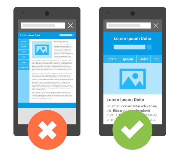 In the USA, 94% of people with smartphones search for local information on their phones.
Source: developers.google.com
Google wants sites to be legible and easy-to-use on smartphones and other mobile devices, as you can see from the image above. If the links and text are so small as to be bothersome or useless, no one will want to visit your site on mobile devices. Google’s main concern is with user-friendliness. Whether users are surfing on a tablet, phone, desktop, or any other device, creating simple, intuitive, and beautiful designs that delight users is the main goal.
The Seven Deadly Sins of Mobile Websites
- Slow to load
- Test not fitted to screen (have to pinch and scroll)
- Frustrating navigation (links too close together)
- Drastically different from desktop version (user is disoriented)
- Popups and Flash (software incompatible with mobile)
- Auto and faulty redirects
- Advertisements and banners
As Google always says, “Focus on the user and all else will follow.”
Are Bing and other search engines boosting mobile-friendly sites as well?
Microsoft and other search engines have mentioned it, but they tend not to push mobile-friendly sites as much as Google. Nevertheless, it is safe to assume that as mobile devices continue to gain traction, all search engines will eventually hop on the Google bandwagon.
Prepare for the PPC Mobilegeddon:
Although Google is only running tests at this point, it is safe to assume that the new mobilegeddon algorithms will soon be applied to PPC ads. Already, The SEM Post has reported seeing “mobile-friendly” tags on PPC ads:
You can check your landing pages with Google’s mobile friendly tester here.
Currently, the AdRank formula runs as follows: (bid * QualityScore + ad extension bonus = AdRank (position)). Based on Google’s push toward mobile-friendliness, it won’t be long before the AdRank formula reads, (bid * QS + ad extension bonus + mobile-friendliness = AdRank).
There is no doubt that Google will soon be applying the same mobile-friendly philosophy to their PPC ads. It is not a question of if, but of when.
The good news? VitalStorm has you covered already!
If VitalStorm is managing your PPC accounts, you have nothing to worry about. We have already designed all of our landing pages to be fully responsive, optimized for all screens and mobile devices!
How to Survive Mobilegeddon:
Google has been wanting this for a long time, so “mobilegeddon” shouldn’t have come as a surprise to anyone. Understandably, as mobile continuous to threaten desktop search as the dominant channel, more emphasis will be put on user experience on mobile devices. Just take a look at this report from 2014, which shows that almost half of all Google’s traffic comes from mobile search:
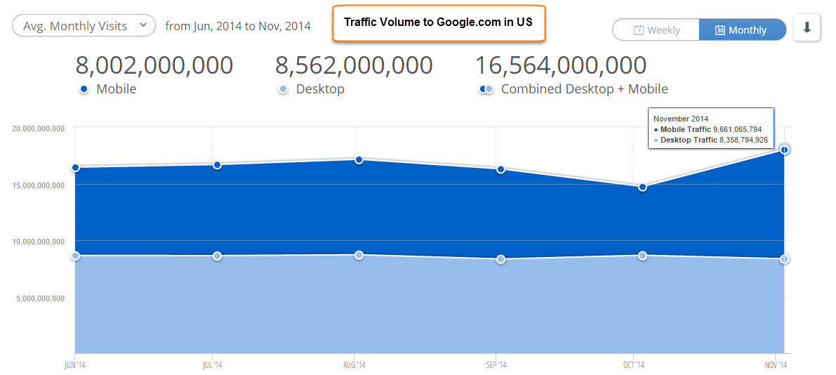
At the end of 2014, approximately 48% of Google searches were made on a mobile device. Expect mobile searches to surpass desktop searches in 2015.
In order to make your site look good on a tablet of smartphone, you need bigger, more readable text, links that are easy to tap, and content that resizes to fit the screen. Basically, you want a site that is easy to read and interact with on all different mobile devices and screen sizes. You can find an array of information for both beginners and experts on Google Webmaster’s Mobile Guide.
You basically have two options:
- Design multiple sites, one for mobile and the other for desktop computers.
- Design a single “responsive” site that adapts to the user’s screen
We highly recommend option 2 – the responsive route! This way, instead of maintaining two different sites, you can save time and stress by making your current site fully optimized for all viewing devices.
Final Takeaway: This is Good!
This is a perfect opportunity for you to reevaluate your entire website. Besides checking for your necessary mobile-friendly tag, you will want to conduct a complete audit of your website design and strategy!
After testing your site for mobile and having an objective third-party evaluate your site for trustworthiness, branding, well-placed calls-to-action, unique selling propositions, compelling content, and ease-of-use, you will have a good idea of where your site stands in the wake of Mobilegeddon.
You don’t necessarily need a new website, but it is a great time to find out. That way, you can take the opportunity to rebuild your website while at the same time ensuring responsive, mobile-friendly design.
Many mobile-friendly changes can be made to your existing site; however, it could be faster and more cost-effective to redesign your website with up-to-date hosting and technology.
Designing a beautiful and intuitive website is easier said than done, however. And even if it is beautiful, is it converting?
Avoid the stress and hassle of designing, hosting, and maintaining your website by getting someone else to do all of it for you.
We can help! Call VitalStorm for your free website review. We specialize in designing completely responsive websites and PPC landing pages to drive qualified leads that convert!
If you still have questions, watch this Google chat:
Everybody will be affected by this new Google update. Mom and pop shops and big companies alike.
Visit our Web Design page and Website Design & Strategy blog for more information about your web development and maintenance needs.
We can help. Call VitalStorm now for your free website review! 1-877-311-5695
Check us out on Facebook, Twitter, and Google+ for more useful digital marketing information.